Kraft - Workshop for Words
Brand Identity
A full brand identity project for a music and performance center with a focus on the quality of the lyrical content. To emphasize Kraft’s identity, I created a typographic visual language based on scripts and engineering tools as inspiration for the brand.
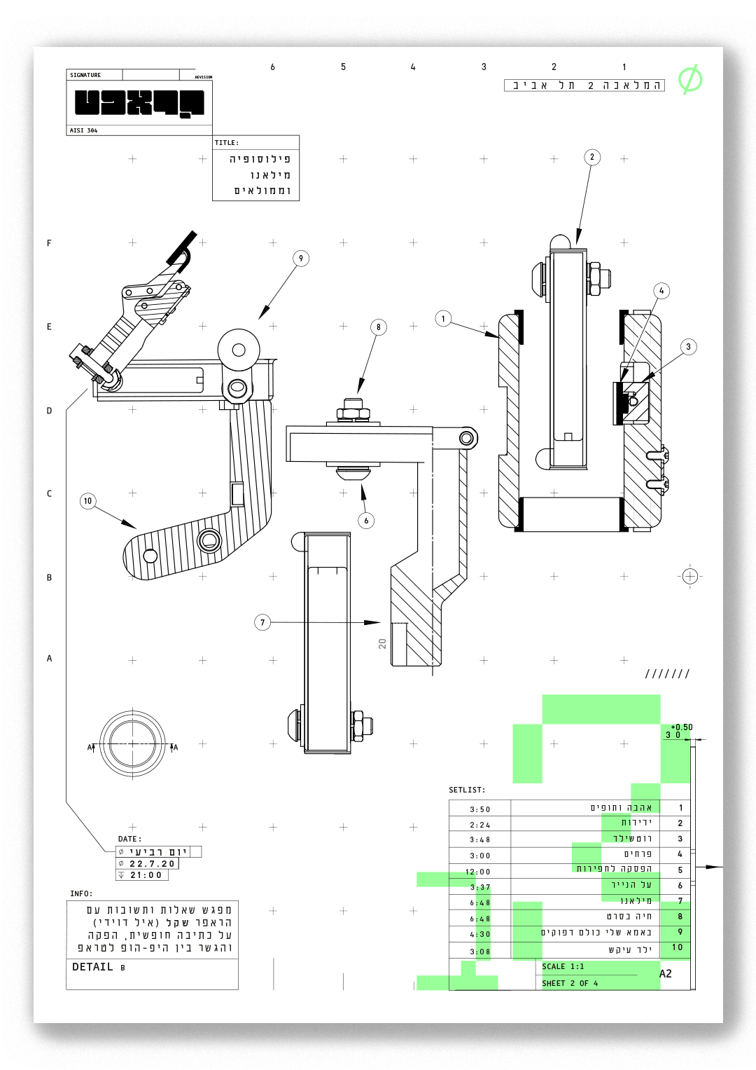
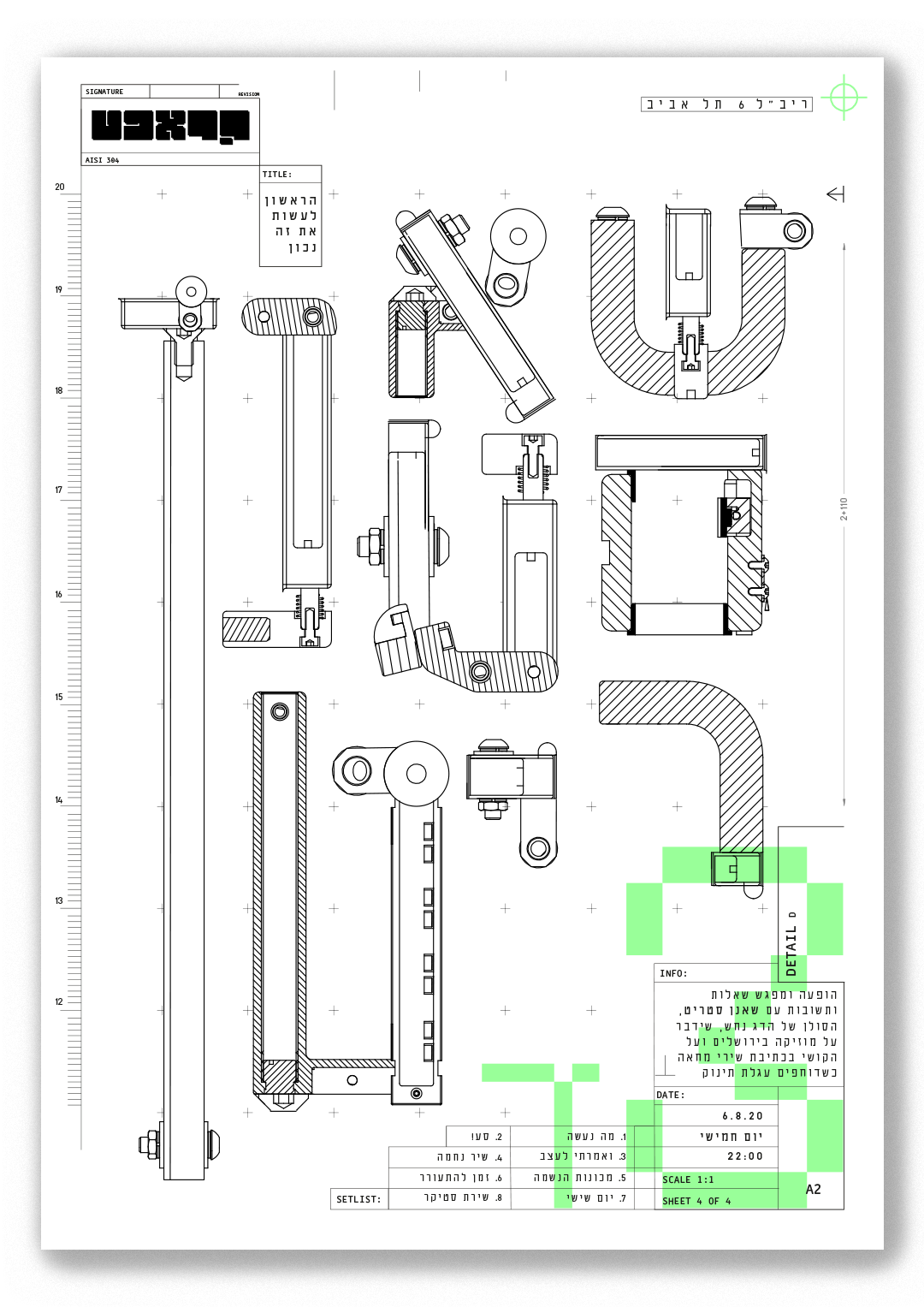

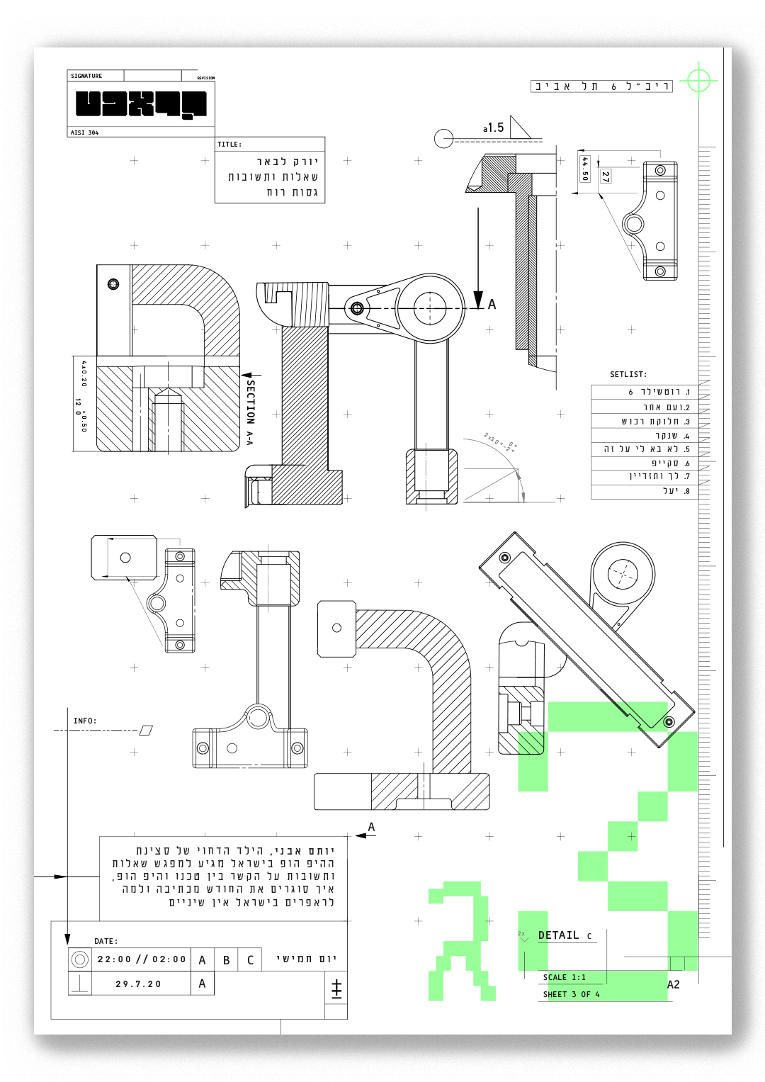
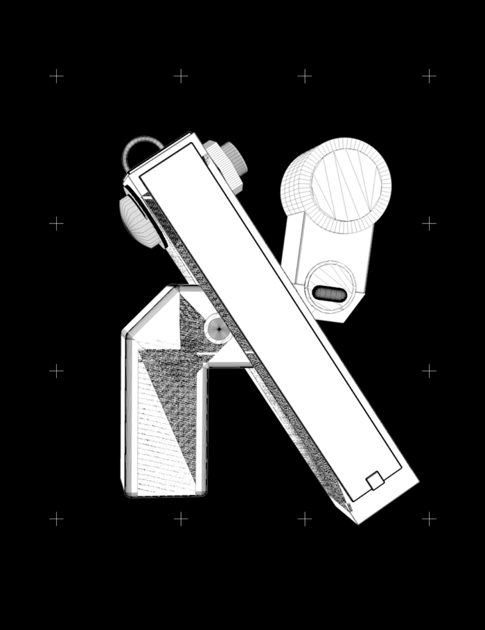
The entire visual identity was created from technical renders of different fields: mechanical engineering, coding and 3d mappings were used as tools the same way that words are tools for lyrical craftsmen such as rappers and spoken-word artists.
Three series of designs were created:
First, a set of four static posters, each for a specific event hosting a perfomer. Second, a set of motion posters that toghether hold all of the yearly events. Third, a desktop website with animated informative.
First, a set of four static posters, each for a specific event hosting a perfomer. Second, a set of motion posters that toghether hold all of the yearly events. Third, a desktop website with animated informative.
This project was created for typographic identity course in Shenkar College under the guidance of Idan Am-Shalem. June 2020