Papaya Global motion branding
Brand Identity, Motion Design, Animation
Following a rebrand process done by Studio Koto, I received the task of composing and developing the entire motion language of the new brand of Papaya Global - a tech pioneer in the world of payments and payroll. That meant creating a motion language that would complement the static new brand while adding a new dimension of character to it.

The new brand’s lively design and vivid new colors fit perfectly with the core values of the company, being in constant movement forward while pushing what was an ancient market into the future.
Symbol animation
When receiving the symbol for Papaya’s logo, I aimed to understand what are the fields of motion that this symbol lived in. The addition of the x and y axes has taught me that Papaya’s symbol might exist in a two-dimensional space, but it exists in constant movement towards the edges of the x and y axes.
When receiving the symbol for Papaya’s logo, I aimed to understand what are the fields of motion that this symbol lived in. The addition of the x and y axes has taught me that Papaya’s symbol might exist in a two-dimensional space, but it exists in constant movement towards the edges of the x and y axes.

This notion has inspired me to animate this in-and-out animation of the symbol, which is also the anchor for the motion language throughout the brand.
Velocity
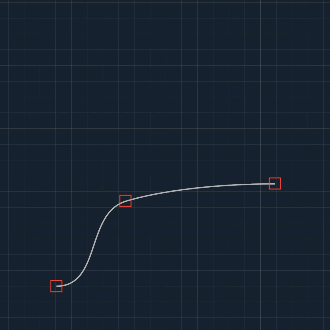
In order to portray one of Papaya Global’s core values of quick and immediate payments that always land on time, I chose to create a two-step velocity pattern that will repeat throughout all of the brand's animations. The pattern begins with a quick and decisive motion that is followed by a smooth and accurate ease-in. This pattern helps to set a connected rhythm to all brand animations across different elements.
In order to portray one of Papaya Global’s core values of quick and immediate payments that always land on time, I chose to create a two-step velocity pattern that will repeat throughout all of the brand's animations. The pattern begins with a quick and decisive motion that is followed by a smooth and accurate ease-in. This pattern helps to set a connected rhythm to all brand animations across different elements.
Graphic Packaging
Video projects are a major part of Papaya Global’s marketing tools. The presence of the brand graphics inside Papaya’s video graphic packaging was a big part of the development of the motion tools.
Video projects are a major part of Papaya Global’s marketing tools. The presence of the brand graphics inside Papaya’s video graphic packaging was a big part of the development of the motion tools.


Typography
Text animation was a key component in the development of Papaya Global’s motion branding. The application of motion in a constant move forward was displayed in the type animations by always maintaining in and out on the positive axis while doing so in swift and agile movement.
![]()
Text animation was a key component in the development of Papaya Global’s motion branding. The application of motion in a constant move forward was displayed in the type animations by always maintaining in and out on the positive axis while doing so in swift and agile movement.


Various sets of type sizes were pre-created for instant use on different future projects: single-word headlines, medium-size texts, and animated running text.
This project was created for Papaya Global’s marketing team. January-March 2023